The brief
A dated platform in a fast-moving market
By 2022, the Web3 and crypto space was moving at breakneck speed — and so were user expectations. Platforms like Binance, OKX, and Crypto.com had set a new bar for what a crypto exchange should look and feel like: sleek, fast, mobile-first, and designed for a generation that grew up on fintech apps. HKD.com's existing interface felt like it belonged to a previous era — cluttered layouts, inconsistent visual hierarchy, and an onboarding flow that assumed prior trading experience. For the younger, less experienced traders the brand was trying to attract, the platform was a barrier rather than an invitation.
The research
Learning from the giants
Before touching any wireframes, I led a competitive UI audit across the major crypto exchanges — studying how Binance structured its information density, how OKX handled progressive disclosure for different trader levels, how Crypto.com simplified its mobile-first onboarding. The goal wasn't to copy, but to understand the conventions that experienced crypto users already expected, and identify where HKD.com could differentiate through clarity and simplicity. We mapped common pain points: overwhelming dashboards, confusing order flows, and poor visual feedback on transaction states.
The approach
Clarity over complexity
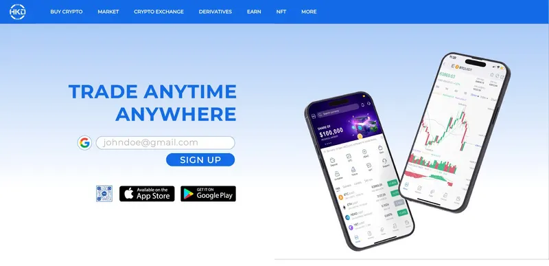
I directed the full UI/UX redesign with a focus on cleaner layouts, stronger alignment systems, and a visual hierarchy that guided users rather than overwhelmed them. The key principle was progressive disclosure — surfacing what a user needs at each stage and tucking advanced functionality behind intentional interactions. We redesigned the core flows: onboarding, portfolio overview, trading interface, and transaction history. The visual language carried through from the rebrand — light, approachable, with trust signals built into every screen through consistent spacing, readable typography, and clear feedback states.
The outcome
Cleaner than the big exchanges, easier for first-timers
The redesign gave HKD.com an interface that held up against the established exchanges by being cleaner and more welcoming. Layouts became more consistent, key trading flows got simpler, and first-time crypto users had less to learn.
UI/UX Redesign
Moving forward
The UI refresh exposed a deeper problem
As we worked through the interface redesign, it became clear that the UI wasn't the only thing that felt dated — the brand itself was holding the platform back. The existing logo and identity leaned heavily Chinese in its visual language, which limited the brand's appeal to the younger, international audience HKD.com was targeting. It didn't communicate the digital-first, Web3-native positioning the product was moving toward. I proposed a full brand refresh — not just cosmetic, but strategic. The goal was to shift HKD.com's visual identity from legacy and regional to modern and globally competitive, creating a brand that felt native to the crypto space rather than retrofitted into it. The direction explored a cleaner, more digital-forward identity system — from logo and colour palette to typography and marketing collateral — designed to align with the refreshed platform experience and give HKD.com a cohesive brand presence from first impression to daily use.