The brief
Not another agency brochure site
HiSEVEN is a digital marketing agency across Singapore, Malaysia, Dubai, and Hong Kong. The old website was a stock-image corporate template — it didn't match the work the agency was doing for clients. Before we touched the site, I refined the brand identity. The existing "Connection" motif was two blue stripes at the angle of the 7 chevron. It looked fine, but there was no story behind it. I gave it one: agency and client, blue and gold, with the agency stripe below as a supporting hand. That narrative — HiSEVEN as the connector between brands and people — became the foundation for everything.
The approach
A digital agency's site should move
Working with Jeff, our Marketing & Creative Lead, and a team of 12 creatives, we rebuilt the website from scratch. The Connection motif lives in the broader brand system — the website carries the same idea through motion and interaction instead. Nothing sits still. Service icons loop. The hero assembles as you land. Cards react when you hover. We wanted the site to feel like it was paying attention to you, the same way a good agency pays attention to its clients.
Making it move without making it heavy
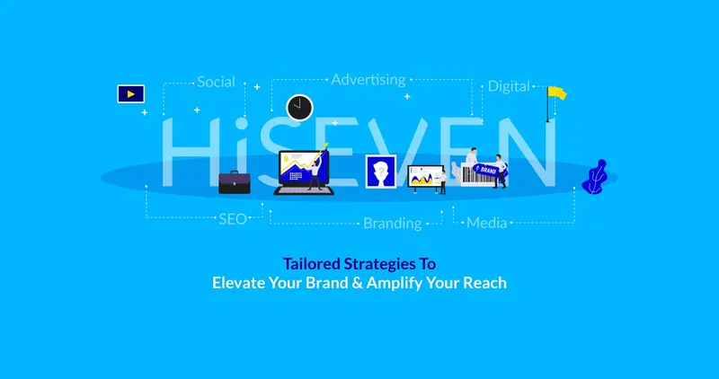
Eight service pages, four markets, products, blog, careers, contact. That's a lot to put on one site without overwhelming people. Static illustrations felt dead. GIFs were too heavy. We explored Lottie — vector-based animations that run from lightweight JSON files — and it clicked. The illustrations could loop on the page, the site would always feel alive, and it wouldn't cost us load time. We art directed each one to match the brand's isometric style: clean shapes, blue accents, no clutter.
Marketing Campaign Social Media SEO Branding Web Development Community Email Marketing Short Message
The rest of the site follows the same principle. Content shows up as you get to it, not all at once. Sections scroll in, cards react on hover, and the nav adapts as you move deeper. The site serves four regional markets — Singapore, Malaysia, Dubai, Hong Kong — with auto-detected routing, and turns off heavy animations on mobile so it stays fast on phones.
Colour & type
Sky Blue and Navy were already in the palette. I tightened them into a proper system and introduced Sunshine — the gold — as the action colour. On the Connection motif, that meant swapping the second blue stripe for gold: agency below in blue, client above in gold. Every colour now has a reason. Typography is Lato across all English content, Noto Sans SC for Chinese markets. Clean, geometric, works at every size.
- Sky Blue #00B6FF
- Navy #000072
- Sunshine #FFD900
- Electric #0506DC
- Nero #1E1E1E
- Ice #B2E9FF
What shipped
One site, four countries, two languages, eight service lines, plus products, blog, and careers. It all runs on the same system and looks like one team built it — because one team did. The site contributed to improved lead generation and won the TechBehemoths Global Excellence Award 2025.
4 regional markets · 8 service verticals · 34 custom animations · 2 languages
The broader system
The website came out of a larger brand refresh. I produced a 25-page brand identity guideline that any designer on the team could pick up and run with — logo usage, the Connection motif, colour rules, icon treatments, illustration direction, and templates for social and video. The website was the biggest deliverable, but it wasn't the only one.
25-Page Brand Guideline · Connection Motif · Icon System · Illustration Direction · Social & Video Templates