The brief
Standing out in the noisiest aisle
The frozen food aisle is one of the most visually cluttered spaces in any supermarket — every brand screams with bold colours, oversized food photography, and discount callouts. YORO, a health-focused frozen food brand, wanted to enter this market with a fundamentally different proposition: natural, balanced, wellness-first. The challenge was creating a brand identity that could communicate premium health credentials at shelf level while competing against established brands with far larger marketing budgets and retail footprints.
The approach
Calm as a competitive advantage
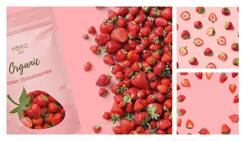
Instead of shouting louder, I designed YORO to be the quiet one that stands out. The brand identity drew from modern Japanese aesthetics — clean forms, natural tones, and deliberate white space — turning visual restraint into a trust signal for health-conscious consumers. The packaging system was built to look unmistakably different at shelf level: where competitors used saturated colours and cluttered layouts, YORO used breathing room, honest ingredient photography, and typography that communicated clarity over hype. The system extended across packaging, social content, and point-of-sale materials.
The outcome
Calm on a loud shelf
The identity and packaging positioned YORO as a premium, wellness-led option that looks like nothing else on the shelf. Its calm, Japanese-inspired look became the brand's strongest difference, signalling quality through restraint. The work covered packaging, social media templates and retail collateral.
See the full project on Behance